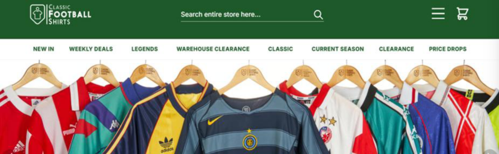
Since its founding in 2006, this Manchester-based company has positioned itself as the “custodians of football memory.” Their business model is unique: they are not only one of the world’s largest online marketplaces for vintage kits but also act as content creators, while operating immersive physical experience stores in locations like New York.
This implies that our customers are not just selling fabric; they are selling a sense of belonging, nostalgia, and storytelling. Every shirt connects fans to glorious moments of the past. Therefore, the design must reflect this profound emotional connection.
When analyzing CFS’s audience, we didn’t just focus on the die-hard fans watching the matches. After discussion, we believe our customers fall into the following categories:
- Core Audience: Primarily male, spanning a wide age range. They are hunting for specific seasons or player versions—even flaws are acceptable. For them, that specific moment in time holds the true value.
- Emerging Audience: With the rise of the “Blockcore” aesthetic, Gen Z and Millennial women are flooding this market. They may not care about the tactical details of the 1998 World Cup, but they love the colors, cuts, and retro vibes of that era.
In terms of market environment, vintage fashion remains a dominant trend. Luxury brands like Gucci and Balenciaga are drawing inspiration from retro sportswear. This presents a massive opportunity for CFS: to expand from a single collector-trading business into the lifestyle sector.

As Art Directors, we have analyzed CFS’s current visual identity:
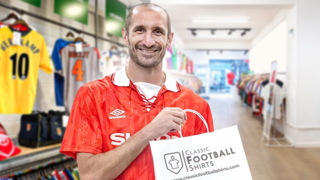
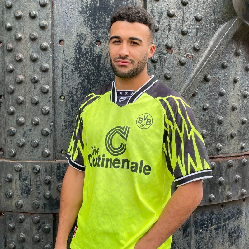
- Photography Style: CFS’s current social media and website primarily utilize high-contrast, vibrant photography. They often use solid color backgrounds to highlight the shirt’s pattern or lifestyle settings (like locker rooms or streets) to create atmosphere.
- Typography & Graphics: Their brand fonts are usually bold and powerful, carrying a strong athletic feel. However, when handling high-end collectibles, it can appear slightly cluttered, lacking the refinement of a luxury product.
- Competitor Comparison: Compared to retro lines launched by Nike or Adidas, CFS’s advantage lies in authenticity. Replicas might be perfect, but they lack the marks of time; CFS items carry a texture of history. Conversely, compared to actual trendy fashion boutiques, CFS’s visual packaging feels overly “blokey” and somewhat outdated, making it weak in attracting female users and hypebeasts.
Based on the analysis above, we plan to proceed with the following approaches:
- Elevating Storytelling: Since every shirt has a story, our design should emphasize the combination of copy and imagery. Instead of just showing the front of the shirt, we should visually guide users to read the history behind it. This will also appeal more to the older collectors who value provenance.
- Visual Optimization for the Female Market: Existing visual assets feature mostly male models. We can introduce more diverse model representation to make the brand more inclusive and fashionable, thereby capturing this fast-growing consumer segment.
The biggest challenge in this process lies in enhancing the brand’s premium feel while maintaining that gritty vintage vibe. We need to find that balance point where a 30-year-old second-hand shirt looks both precious and effortlessly cool.
Leave a Reply