Brand Overview
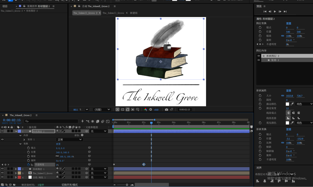
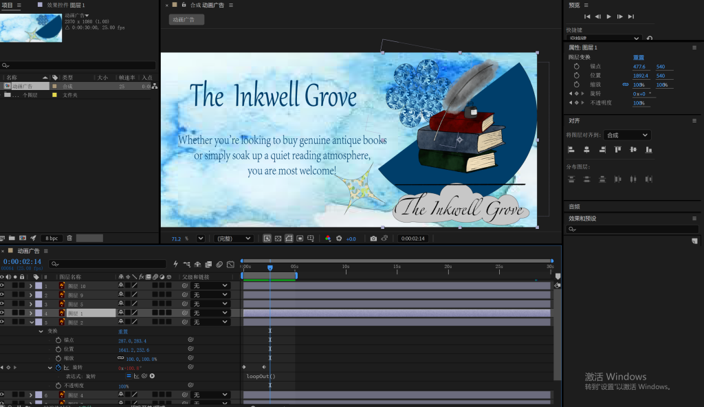
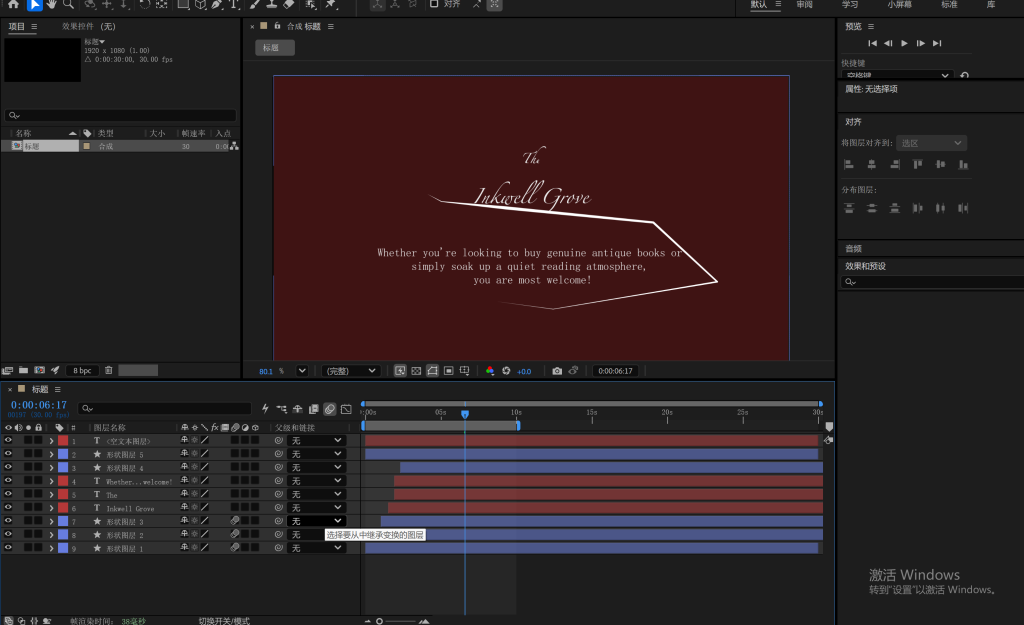
The Inkwell Grove is an independent bookstore dedicated to antique books and curated reading experiences.
Visual Style & Color Palette
The visual identity is defined by a vintage, warm, and textured aesthetic.
- Primary Color: Evergreen (#20301f) – Symbolizing the sedimentation of knowledge and natural serenity.
- Secondary Color: Grey Olive (#8a8d91) – Evoking a sense of classical tranquility, reminiscent of light ink washes.
- Accent Color: Dark Garnet (#521104) – A hue often found on book covers, adding visual warmth and vitality.
Typography
- Headings: Script fonts are used to embody literary elegance and timeless classics.
- Body Text: Sans-serif fonts ensure clarity and modernity for digital readability.
Design Rationale
During the initial design phase, “The Inkwell Grove” was selected from a range of options for its sophisticated atmosphere, making it a fitting name for an antiquarian bookstore.
Centering on the brand’s core philosophy—”the sedimentation of time”—I avoided aggressive bouncing or rapid movements in the animations. Instead, I utilized smooth ease-in and ease-out transitions to cultivate a sense of grace and composure. This approach aligns perfectly with the bookstore’s quiet, healing, and elegant ambiance.
Motion Brand Assets Showcase
The following projects were created based on the brand guidelines above to demonstrate the brand’s animation language:
- Animated Logo
- Animated Typography
- Animated Illustration
Leave a Reply