My project is to build a brand-new digital platform prototype for Participatory Collective, a grassroots community network based in Hull, UK. This network consists of dozens of independent local voluntary groups spanning a wide range of fields, each with its own distinct identity. My core goal is not to create a hierarchically structured official brand website, but to build a digital platform that follows the principle of “harmony without uniformity”. The platform will provide a unified entry point for local residents to find all community services and activities, while preserving the full autonomy of each member group, so that they can tell their own community stories on their own terms.
During my earlier research, I discovered that these community groups already hold a wealth of vivid, deeply touching activity photos and resident stories. In the past, these valuable real materials were scattered across outdated, rarely updated old websites and poorly managed social media accounts, remaining largely unseen. The design priority of this project is to bring these previously hidden authentic voices to the most prominent, central position.
Initial Wireframes and Layout Planning
I reviewed and re-examined every previous scheme, documenting why some options were selected and others discarded. The abandoned scheme adopted a structure that placed a long introductory text at the homepage top, followed by a neatly sorted directory of member groups. Its biggest flaw was the strong implied hierarchy, which made Participatory Collective appear as the dominant authority, with member groups positioned as secondary subordinates — a model completely contrary to my original goal. All the final design solutions prioritize de-hierarchization and equal representation.
Layout Logic for Core Pages
Homepage Wireframe
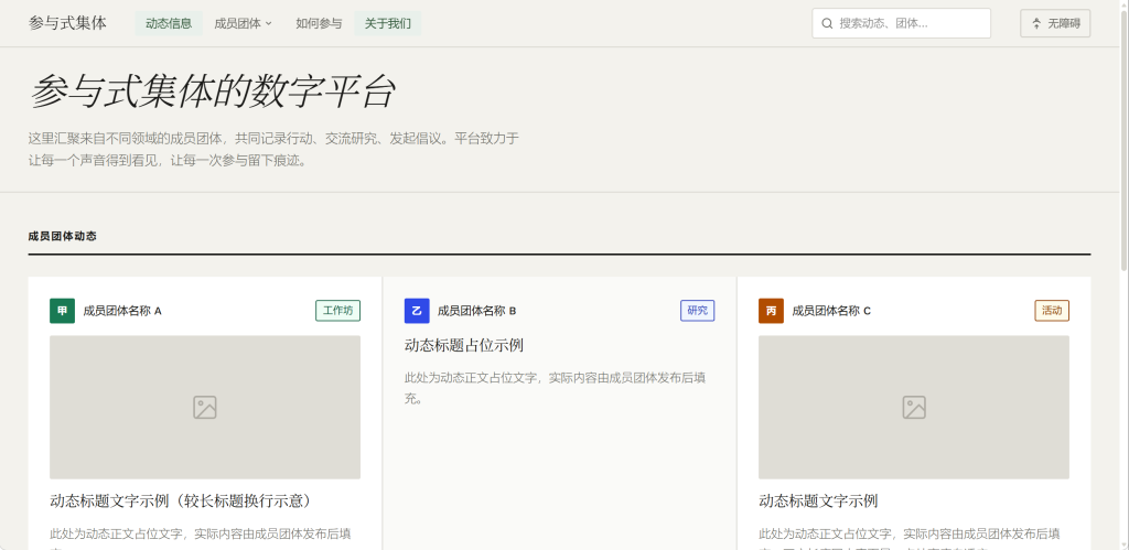
I divided the entire homepage into distinct functional blocks, instead of using full-screen oversized hero banners:
- At the very top is a minimalist persistent navigation bar, containing links to Updates, Member Groups, How to Get Involved, and About Us, with a global search box and accessibility mode toggle button on the right side.
- Below the navigation is a narrow introductory zone, with no large hero images. It only displays a short line of text introducing the platform as “The collective hub for grassroots community activities in Hull”, with an even smaller line of supplementary description underneath — understated enough not to distract, but clear enough for new visitors to grasp the platform’s purpose immediately.
- The vast majority of the core page space is dedicated to a time-sorted dynamic card feed of updates from member groups. Each card has a consistent fixed width, while its height adapts dynamically to the length of its content.
- The page footer includes the collective’s logo, accessibility statement, privacy policy link and other necessary information.
This layout ensures that visitors land directly on the latest community activity photos and story headlines as soon as they open the site. Even first-time users can quickly understand what is happening in the local community and start engaging right away.
Member Group Detail Page Wireframe
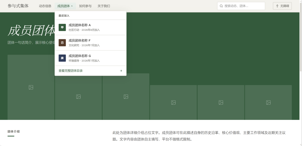
On this page, only the global unified navigation bar is retained at the top, and all remaining space is left for each group to customize freely. Groups can upload their own hero visuals, display their chosen name, and set their own brand accent colors. The lower half of the page uses a unified modular structure to arrange upcoming events, published stories, and contact information. This balance preserves the unique characteristics of each group while keeping the overall interface consistent and uncluttered.
Participation Page Wireframe
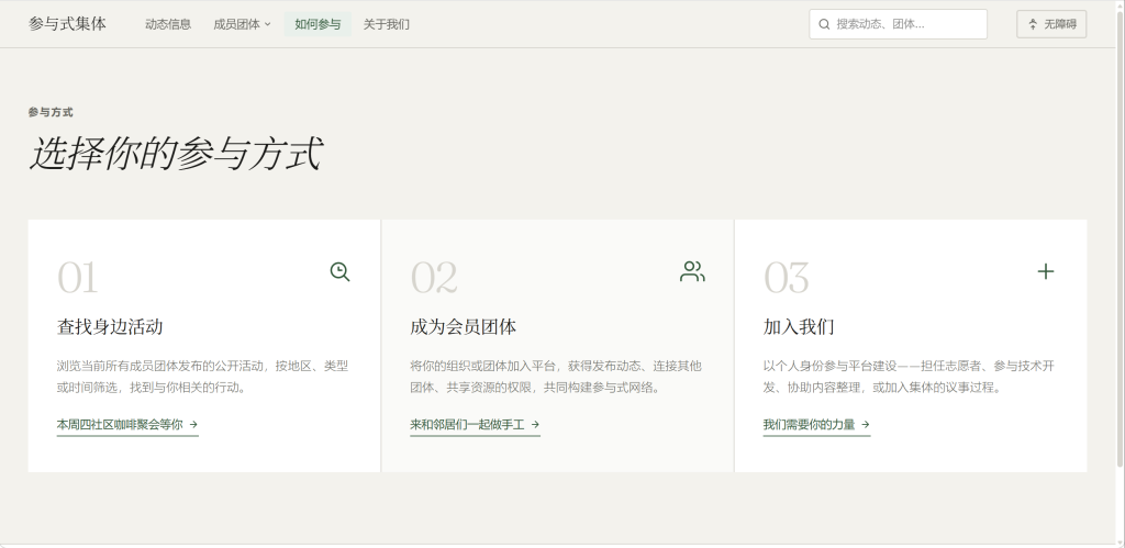
I designed three side-by-side card blocks: Find Local Activities, Become a Member Group, and Join Us. Each block has its own independent jump entry. As convoluted processes are a major factor that discourages user engagement, this streamlined setup eliminates unnecessary steps completely.
Core User Navigation Path Design
I tested the browsing paths for users with different needs, and the results fully align with my goal of simplifying workflows:
- Ordinary residents looking for activities: Open the homepage → scroll through the dynamic feed → click the card to view the exact time and location of the activity → add the event to their calendar with one click or get more details. The path is highly targeted and free of distractions.
- Users wanting to join a specific group: Click the “Member Groups” option in the top navigation bar → filter the list to find the target group → enter the group’s dedicated page and get their contact details. No irrelevant information interrupts the journey.
- Users wanting to register a new community group: Click “How to Get Involved” in the top navigation → select the “Become a Member Group” entry → read the joining guidelines and submit the application form directly. No redundant, convoluted procedures are included.
I previously experimented with adding a side classification filter bar on the homepage, but found that it took up a large portion of screen space, squeezed the display area of dynamic cards, and made the layout cramped. I later integrated all filtering functions into a single row of tags at the top of the information feed. This adjustment preserves full filtering functionality without obstructing the presentation of content.
Core Screens and Interaction Logic Annotations
Homepage Feed Interaction
When a user clicks on any dynamic card, the card lifts slightly, and a side detail panel slides out from the right side of the current page. Users can close the panel by clicking outside of it and return directly to the feed to continue browsing, eliminating disruptive full-page jumps. This interaction references familiar social media browsing habits, greatly reduces interruptions to immersive reading, and dramatically speeds up information access. This design is also particularly friendly to older residents who are less experienced with complex websites.
Navigation Bar Interaction
When the user scrolls the page down past the height of one full screen, the top navigation bar automatically shrinks into a narrower semi-transparent floating bar, retaining only core navigation text and the search icon. This frees up maximum screen space for content display. When users click the “Member Groups” option in the navigation, a mini preview panel drops down, showing the 3 most recently joined groups alongside a direct link to the full directory, further reducing unnecessary page jumps.
Accessibility Mode Interaction
When users click the accessibility button in the navigation bar, the entire interface instantly switches to the predefined accessibility mode: all text sizes are increased, text-to-background contrast is raised, and the clickable hot zones of all interactive buttons are expanded.
Call to Action (CTA) Strategy: Rooting Engagement in Real Community Needs
I did not use full-screen pop-up windows, splash screen ads, or other forced interruptive CTAs. Every call to action in this platform is seamlessly integrated into the overall design.
| CTA Goal | Placement | User Motivation Design |
|---|---|---|
| Sign up for nearby community activities | At the bottom of every activity dynamic card | I replaced generic “Sign Up Now” text with context-specific copy like “Come and make crafts with your neighbours” or “Our community coffee morning is waiting for you this Thursday”. This uses the real scenario shown on the card itself as the motivation, which is more intuitive, more human, and far more persuasive. |
| Subscribe to the community update mailing list | Inline block at the very bottom of the homepage feed | The copy replaces generic “Subscribe to our newsletter” with “Receive a weekly roundup of Hull’s latest free local activities, no ads, unsubscribe at any time”. This directly addresses users’ common concerns about unwanted charges or excessive spam emails, and saves the time of residents (including many elderly and visually impaired users) who lack convenient access to scattered local event notices. |
| Share your own community stories | At the end of the “Community Voices” section | The button text reads: “Did you have a warm moment in our community? Tell us, and we’ll share it just as you told it”. There are no strict requirements for submissions — users do not need to write polished, official long essays. They can send voice recordings, casual notes, or casual photos taken on their phones, all of which will be eligible to be published. This provides a wider audience for their stories, forming the emotional backbone of the whole platform. |
| Apply to become a new member group | At the end of the “How to Get Involved” page | The button says “Add your grassroots group to this network, and share all our promotion resources”. Many newly formed small groups have no marketing budget at all, and joining the platform gives them a free, high-traffic display entry point that directly solves their exposure challenges. |
I deliberately designed all core CTA buttons to blend in completely with the information feed cards, without using harsh bright colors to force attention. The operating ethos of this community platform is built on sincerity — exaggerated marketing-style buttons would feel inauthentic to users and make them less willing to click. None of the CTAs require users to register an account first. Activities sign-ups and story submissions can all be done directly via a guest form, which dramatically lowers the barrier to participation.
User-Centred Design Decisions
Virtually every design decision in this platform maps back to a real user need identified in earlier research, with no superfluous or irrelevant functionality added.
Persona-Driven Decisions
Following interviews with visually impaired users, who reported that the small, cluttered text on many mainstream websites was almost unreadable, I selected the Inter typeface as the default across the whole site. This sans-serif font has excellent legibility even at smaller sizes. I also set the minimum body text size to 18pt — higher than the common 14pt web default — specifically to accommodate older community members who may not use digital tools very often.
In-Depth Accessibility Design Considerations
In the prototype, I completely avoided designs that rely solely on color to indicate status. For example, when the user hovers over a button, in addition to the color darkening, the button also gets a visibly thicker border. This ensures that color-blind users can clearly perceive which element is currently selected, even if they cannot distinguish color differences. All interactive icons are paired with visible text labels: not a single icon-only button exists, even the search button displays the word “Search” next to the magnifying glass icon.
Embedding Community Values
I deliberately avoided formal bureaucratic language commonly used by official organisations, such as “submit materials”, “qualification check” or “approval granted”. Instead, the copy uses equal, conversational phrasing like “tell us a bit about your group”, “we’ll have a chat”, and “help you join the network”. These groups already have strong independent initiative, so the platform’s role is simply to build a shared table, not to dictate terms from a top-down position.
Feedback and Iteration: Optimisations From Real User Perspectives
While building the prototype, I ran user testing sessions with peers and local research participants, collected a great deal of valuable feedback, and made corresponding optimisations:
- Feedback: “All the dynamic cards on the homepage are sorted chronologically, but if I only want to find updates related to visual impairment support, I have to scroll for a very long time to find what I need.”
- Optimisation: I added a row of category tags at the top of the information feed: All, Visual Impairment Support, Elderly Services, Children’s Activities, Environmental Projects, and Mutual Aid Groups. Users can click the corresponding tag to instantly filter all updates in that specific field, preserving the time-sorted logic while enabling precise targeted searches.
- Feedback: “The ‘High Contrast Mode’ was hidden in a small button on the far right of the navigation bar, so many first-time visitors with low vision could not find it easily.”
- Optimisation: I moved the accessibility mode toggle to the most prominent position in the entire website, directly to the left of the site name. When a user first opens the site, a gentle non-intrusive pop-up asks if they would like to switch to accessibility browsing mode.
- Feedback: “If I want to contact other member groups to plan a joint event, I have to click one by one into their detail pages to find contact information — this is far too slow.”
- Optimisation: I added a quick “Send Message” button directly on each group card in the “Member Groups” directory. Group administrators receive a background notification and can reply directly, without needing to expose their private contact information. This makes cross-group collaboration much easier, while still protecting personal privacy.
There were also suggestions I carefully considered and ultimately declined. For example, one recommendation was to add a full-screen scrolling banner at the top of the homepage to highlight the biggest upcoming large-scale event. I rejected this change, because once we grant one group’s activity a privileged position above all other content, we break the fundamental principle that all groups are displayed equally. Large flagship events can naturally gain higher exposure by publishing multiple updates, they do not need a special banner to artificially elevate their priority — to do so would undermine the entire project’s core foundation of “harmony without uniformity”.
Ethical and Sustainable Design: Building Truly Responsible Community Products
I removed all unnecessary large auto-play videos and distracting animated backgrounds. The total file size of the prototype pages is kept extremely small, which reduces user mobile data consumption and cuts down website operating carbon emissions, fully aligning with low-carbon sustainable design principles.
All community residents’ content and photos are designed to remain fully copyrighted by their original creators from the outset. The platform will never use their materials without explicit permission. Every resident story displayed on the site will be published only after the person involved has given their informed consent. I never used unauthorised community imagery just to make the site look more polished.
I have reserved dedicated alt text input fields for every non-decorative image across the site. When content is added later, all uploaded photos will be required to include an accurate, detailed text description, so that screen reader users can fully understand the scenes captured in community event photographs. I have also pre-built full dark mode support in the prototype, to reduce eye strain from extended screen browsing.
I deliberately removed gendered, class-based stereotypical language from all copy. Phrases like “Mums’ coffee morning” that make assumptions about identity have been replaced with inclusive phrasing like “Parents & Carers Coffee Meetup”, ensuring that no resident of any background will feel excluded the moment they open the website.
Leave a Reply