Introduction
The Participatory Collective is a developing network of local grassroots community groups in Hull, UK, bringing together local voluntary organizations from many fields. My understanding of its mission is to unite small groups, share resources, amplify voices, and coordinate joint actions while preserving the unique identities and autonomy of all member groups, which is the principle of “harmony without uniformity”.
Research on Existing Members
Currently, most members have the following drawbacks:
Lack of operational promotion. There is no unified entry point when residents need to seek help or join them.
The websites have not been maintained for a long time. Long – term non – updates make the websites look very old – fashioned and difficult to read, invisibly increasing the difficulty for residents to participate in activities.
Low collective recognition. Each group has its own separate promotion style. Although it is beneficial for individual activities, it is not conducive to the Participatory Collective itself.
No accessibility adaptation. For example, a group like “Butterfly” that focuses on visually impaired people needs more adjustments in this regard.
There are also advantages:
It contains a large number of real photos of activity records, which are emotionally sincere and conducive to dissemination.
Design Case Study
I investigated the best practices of inclusive ethical design in existing community networks to provide a reference for this project:
Core Ethical Design Cases
Local Trust brand update in the UK: Local Trust is a foundation that funds community development in the UK, serving more than 150 local neighborhood groups. Its design system retains a unified core logo and layout grid, but allows each local group to customize colors, textures, and content, avoiding the common problem of top – down brand erasing local differences, which fully aligns with the mission of the Participatory Collective.
The digital platform of the Co – operatives UK: Its official website places the original content of member cooperatives at the core of the homepage instead of top – down official content. At the same time, the entire platform prioritizes meeting the WCAG AA – level accessibility standard, has a built – in high – contrast mode, and mandates that all content add alternative text. I decided to use this as a reference for this design.
I drew two low – fidelity homepage sketches as primary directions:
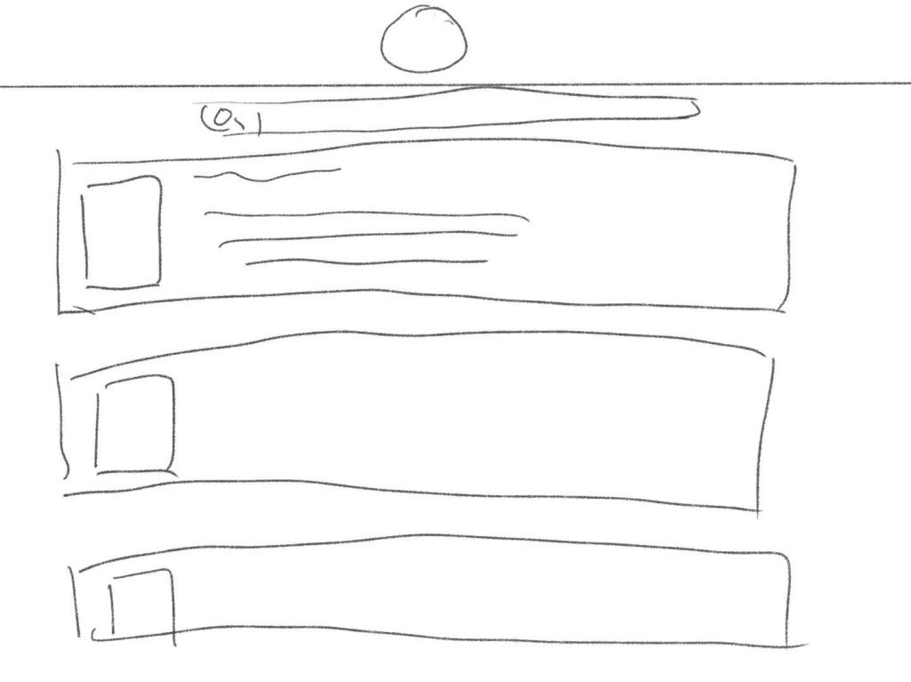
The first one: The homepage has a fixed collective introduction, followed by a sortable directory of member groups. I think this layout has simple navigation, but for the Participatory Collective, it has a strong sense of hierarchy and does not well reflect the equal and collaborative characteristics of each group.
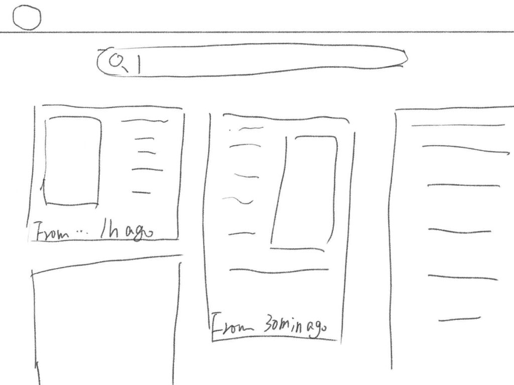
The second one: The homepage displays the latest updates of all member groups in chronological order, with a navigation bar for users to search for their target groups. I think this scheme better reflects the vitality of each group and helps users quickly find the information they need.
Visual Exploration
I decided to carry out the design around the principle of “harmony without uniformity”:
I designed three primary drafts:
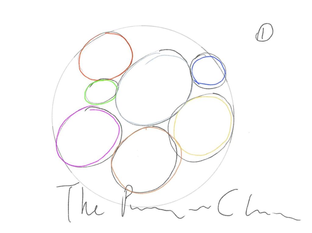
The first one uses circles of different sizes connected by lines to represent the aggregation of different groups. Although the meaning is intuitive, the style is too ordinary and fails to reflect the autonomy of members.
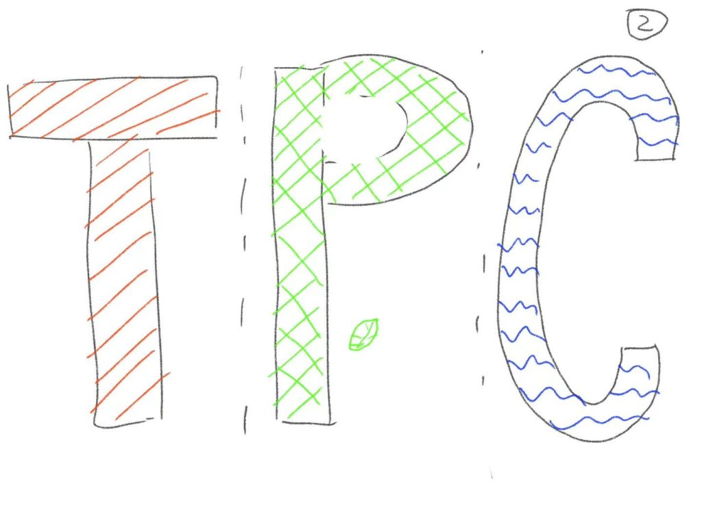
The second one fills each letter of “Participatory Collective” with different styles and textures (such as leaves, fabrics, wood, etc.) to represent different community work fields. Although it can well convey diversity, it becomes blurred and unreadable when reduced to a social media avatar or footer, looking very messy. However, this idea is good and can be used in background design.
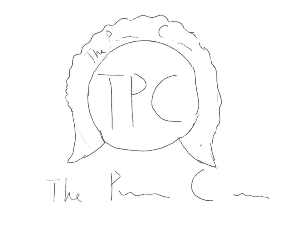
The third one is a simple and flexible open circular frame representing the collective network. The center of the frame is blank, and any member group can place its own logo in the center, easily obtaining a distinctive and unified icon. This design is scalable and easy to recognize, essentially reflecting the mission of the collective.
For accessibility and openness, I will choose Inter as the main font for the entire communication campaign for the following reasons:
It is open – source and free, suitable for non – profit projects.
It is designed for screen reading, with a large x – height, which is more friendly to low – vision users.
It fully meets the accessibility requirements, supports multiple languages, and can meet the needs of diverse community groups.
Color Scheme
The core uses warm light gray and soft olive green for the text and background, providing a calm and gentle background color, echoing the collective’s focus on the local community.
Five replaceable accent colors (azure blue, terracotta red, cream yellow, dark purple, grass green) are provided. Member groups can freely choose accent colors to customize their own sections on the platform, allowing each group to retain its unique visual identity while ensuring a unified overall experience.
A high – contrast mode specifically designed for low – vision users is built – in. At the same time, it avoids using only colors to convey important information. All interactive elements are added with icons and text labels to adapt to color – vision – impaired users.
Reflection
Regarding: How to convey the voices of multiple community groups?
My decision is to decentralize rather than have a central communication team control the narrative:
Each member group has the editing authority for its own sub – page, can publish updates on its own, and tell its own story in its own way without the need for a central designer to rewrite the content.
The homepage prioritizes displaying community content rather than brand information: The default view is a stream of the latest activities, stories, and updates of all member groups, allowing new visitors to see real community work at first sight rather than an incomprehensible official introduction.
Columns such as “Community Voices” can also be regularly opened to publish original and unedited stories and testimonials by group members, paired with photos taken by the members themselves, ensuring the authenticity of the narrative and being rooted in real – life experiences.
Regarding: How to make the design unified without erasing differences?
The central website only unifies basic elements (main font, layout grid, core brand logo). Each member group can fully customize accent colors, content structure, etc., retaining autonomy.
Members are not required to replace their original independent brands: They only need to add the open – frame logo of the Participatory Collective to their logos to identify their membership, retaining the independence of the original brands.
The platform is positioned as a network of independent groups rather than a new organization, and the layout also uses a de – hierarchical visual language to echo the distributed structural characteristics.
Leave a Reply